“Cranberry Goes to the Block Party”, Illustrations, Design and Printing

Cranberry Goes to the Block Party is finished, bound and delivered. I initially posted a sketch and outlined the idea back in May, and through the following months worked out the illustrations, designed the text and coordinated the printing and binding of a very small but important number of copies—this was given as a Christmas gift to members of my customer’s family in memory of their mother and grandmother, and now great-grandmother.
My customer and friend wrote this brief little book, not so much for the sake of publishing, but for the sake of memory. She grew up on Long Island and her mother was a librarian and cat lover. She remembered her mother reading the books of Clare Turlay Newberry and studying the illustrations, and carried on the tradition with her daughters.

Maggie, the author, lost her mother in 2009 after a stroke, but her mother’s one adamant wish was that Maggie would take her Siamese cat, Cranberry, even though she had two children in New York who liked cats and Maggie is in Pittsburgh. Cranberry still lives with Maggie and is a daily reminder of her mother.
After a happy little instance with Cranberry Maggie quickly wrote a simple story, visualizing it as a children’s book in much the same style as the books her mother had read to her while growing up, and those she had read to her girls. When she told me about it she asked me if I would illustrate it someday, but at that time my own mother was in her last year and to my great sadness I had little time for art.

A few of my readers have compared my sketches to Clare Turlay Newberry, which for me is an incredible honor—to be compared to one of the most famous feline illustrators in history! I told this to my Maggie, who recalled her book and said she’d love to see it through and dedicate it to her mother. She sent me a copy of Newberry’s Marshmallow (above) as the book she most visualized while she was writing; if you get a chance to read Marshmallow, you’ll love the story, and both Marshmallow and Oliver as well!
I had begun with my favorite, comfortable pencil sketches, but with that book went on an all-out study of Clare Turlay Newberry’s work, style and life. As an illustrator, I am often given a style suggestion for which I’m grateful because it gives me both a clear idea of what my customer wants and a challenge to work in a style that may be quite different from my own. Emulating, not copying, a famous artist’s style, I begin with finding my own similarities, then by studying the artist, gathering more details specific to her, and most importantly, learning. It’s how I’ve learned most of what I know about drawing and painting, by studying.
As I worked my way through a few sample sketches I found the initial charcoal to be lovely, very fun and true to Newberry, but they were fragile, losing charcoal with handling even on good toothy paper, and didn’t scan well.

I decided to work out the sketches in pencil, with which I have a lifelong relationship, and I’ve loosened up my pencil style in all the daily sketches I’ve done of my cats in the past year. I designed them freehand, based on the events in the story and photos of Maggie’s cats which I have from visits, sketching the basis in light pencil lines on the paper, then filling in the details on top of that basis, all done on one sheet, one sketch per sheet.
The pencil sketches are durable and scanned well, but didn’t have that free and loose feel of the original charcoal. Maggie mentioned this when we reviewed the sketches and the first draft of the book, and I agreed.
In studying Newberry I had discovered that her drawings weren’t in charcoal after all, but were in black and white pastel. I would say I have a familiarity with pastels, and also a set of black, gray and white pastels that would work perfectly. Referring back to the sketches in Marshmallow that we were using as a guide, I noticed that the originals were all done in only black, no shades of gray and no highlights added; the color shown in the book was added later, and we were planning color only on the cover. I do love to “muck around” in my pastels, as I call it, and for me it’s often closer to finger painting as I add more pastel to my paper and run my fingers over and through it to mix and blend and even sharpen details. But I also love to use a single color of a medium, especially black, used to show its best assets, be it soft side-blending from a pencil, sketchy lines and crosshatches with a pen, or finger-blended pastel dragged across the page to create a contour with the shape of the shadow.
So, black pastel it was!
I sketched my way through all the illustrations in black pastel, and immediately grew to love three of the sketches, and was pleased with the rest. That love is a good sign, no matter if it’s an illustration, graphic design, website, or brochure copy, and it’s never steered me wrong. I completed another draft of the book, this time with covers and actual text placement, Maggie approved, and it was time to move forward.
I’ve been quoting printed pieces of all sorts for about 25 years, and had a good idea of cover, text and finishing for this, as well as a few local printers with whom I already work who could do each part of the finishing. I had designed the book at 6″ x 9″, keeping in mind standard paper sizes and a cover that would wrap all the way around the book in one piece. Even with a few blanks, front matter pages and feline and human profiles in the back, the book was not thick enough to perfect bind, only 20 pages maximum, which on even 80# text didn’t add up. Maggie didn’t care for the idea of saddle-stitching, or stapling along the spine, and neither did I because we really wanted to keep with the original idea of the illustrated soft-cover children’s books we remembered from childhood.
Knowing the book’s stacked text pages had to reach a certain thickness in order to be perfect bound, where the edges of the pages are individually glued into the spine with a cover that wraps around and is squared flush around it, I wondered about the possibility of using heavy text stock or even cover stock, and that was what we ended up using. Printed on 100# matte-finish cover for the text pages the book was just thick enough for perfect binding, and the cover would be 120# cover coated on one side, which would of course be the outside. We had determined the cover would have color, and even though it would be digitally printed and we could use full color, we decided to just use one color in addition to the black, choosing a warm peach color. The covers went to the printer who could print on 13″ x 19″ paper, the text pages went to another printer who had the best quality black printing for the details of the illustrations, then the whole stack went to the bindery along with my taped and glued folding dummy.

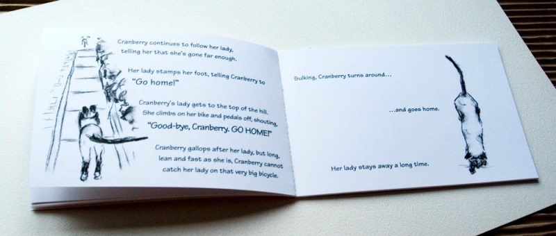
So there we are! I’m so happy to have been able to do this for Maggie. Now I have the taste for little illustrated books that are perfect bound. We’ll see what I come up with next! In the meantime, enjoy a few more favorite spreads from the book and a few of the illustrations.


All images used on this site are copyrighted to Bernadette E. Kazmarski unless otherwise noted and may not be used without my written permission. Please ask if you are interested in using one in a print or internet publication. If you are interested in purchasing a print of this image or a product including this image, check my Etsy shop or Fine Art America profile to see if I have it available already. If you don’t find it there, visit Ordering Custom Artwork for more information on a custom greeting card, print or other item.
Discover more from The Creative Cat
Subscribe to get the latest posts sent to your email.
Pingback: From the Archives: A Square of Sunshine, July 13, 2005 - The Creative Cat
Pingback: Daily Sketch Reprise: Listening to Granados, de Falla and Rodrigo, 2014 ~ The Creative Cat
Pingback: From the Archives: Still Life With Orange Cat and More from 2007 ~ The Creative Cat
Pingback: Rescue Story: A Little Baby Foster Kitten ~ The Creative Cat
Pingback: The Creative Cat - Daily Photo: Is Life A Bowl of Cherries?
Pingback: The Creative Cat - From the Archives: Still Life With Orange Cat, June 27, 2007
Pingback: The Creative Cat - Daily Photo: Sending Me on a Guilt Trip, and Visiting Kitty Cousins
Pingback: The Creative Cat - Framed Original Sketches On Their Way
Pingback: The Creative Cat - Muse Medallions and a Special Award in the CWA Communications Contest
Pingback: The Creative Cat - Others’ Fine Felines: Cranberry in Sunshine
Pingback: “Cranberry Goes to the Block Party”, Illustrations, Design and Printing | What's New in Bernadette's Studio?
Bernadette, it was such a joy to work with you on this book. I am delighted by “our” book. Of course we are good friends, but I was so touched by what you wrote about the process. You fully understood my motivation in writing about Cranberry, and what you wrote about my mother was a tribute in its on right. I just wrote a little ode about Ida Elisabeth…maybe it’s time for another book!
Thank you.
Pingback: MICHELLA « LÉIA BEVILACQUA
It’s just beautiful, Bernadette.
: ) GG
Thank you so much, GG!
If I ever write a book, Bernadette..I would like u to illustrate it, too:) I enjoyed reading about ur journey illustrating Cranberry’s book:)
Peggy, get writing, I’m looking forward to it!