What’s On My Easel: Nikka’s Jupiter Ball, a New Painting
Pretty good start on my next painting, one of my cats from years ago in a pose I’ve wanted to paint for about 20 years. I had thought I would move to one of the looser and less representational paintings that I have in mind, but this girl kept coming up. So I guess it’s her turn.
Nikka was a dilute tortie, one of the kittens from the first litter I rescued in 1988 who was adopted and then later came back to me.
I usually work an entire painting at one time, moving over the entire surface from rough to detail and letting it emerge, but Nikka was so speckled that I wanted to be sure I got her under control before I started the rest of the painting.
This is actually my March feline featured artwork, but it took me some extra time to determine exactly how much of the scene I wanted to include in the painting. Now that I’m started, it’s time to roll!
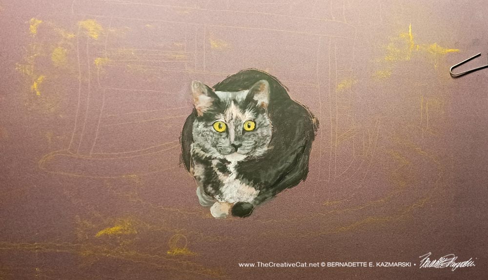
Nikka’s Jupiter Ball in progress
It’s titled “Nikka’s Jupiter Ball” because what inspired it is Nikka’s excited expression and her ball right there, a moment I saw when I walked into my bedroom one late afternoon and saw here in the sun under the rocker, then saw the ball and understood. It was her favorite toy and she always got the big round eyes when she saw it, then she’d bat it all over the room.
Above is what I posted on Instagram on Tuesday evening when I finished the draft to that point after about an hour’s work. I rarely do a “what’s on my easel” post because what I’m working on is often commissioned and I like to keep those private until the customer has approved. I often work non-commission works quickly enough that I don’t get a chance to post progress shots. Paintings often go through an awkward stage like any juvenile while I work out details and colors and proportion.
But when I finished that first draft of Nikka isolated on the paper and she looked so realistic with just the sketch around her I had to share right away. Since I’m working on her each day I also wanted to share that update too, and a few ideas regarding finishing. Here’s what she looked like by the time I finished Wednesday after another two hours of work.
This is just about the whole painting with all the rough edges and test swatches around the edges and tape and paper clips. You can still see bits of my outline on the paper from when I laid out the original sketch on the paper. For an idea of size, the paper is 19″ wide and 14″ tall.
I mentioned at the beginning that I was having difficulty deciding how much of the image I was using I’d include, and that held me back in getting started because that would determine how big the total painting would be. Really, I put this composite together years ago, some time after I lost her in 2002. She predated my digital cameras so I didn’t catch her in this pose. I created a layout in Photoshop from photos of that area of my bedroom at the same approximate time for the light, and photos of Nikka I scanned from film to add to it.
I’ve pulled her out to paint several times since then but kept coming up against that same decision. How much and how big?
After I painted my tri-color girls last year I knew I would want to paint Nikka soon, and here it is a year later, but a good time because, like the tri-color girls, this image and memory are from late winter. I actually pulled this out in January so that I’d get it done for March, but I hit the same stumbling block I had before: how much of the painting do I include? Last weekend I decided to just paint her on the paper with enough space to add if I wanted to, and that was the only way I was going to decide on the image.
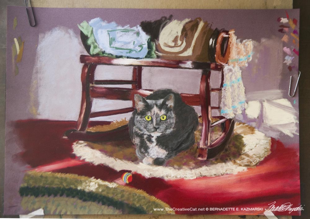
I have two sample crops below that are my two best ideas of the finished composition; I did have one that included the rocker and all of both pillows which would have made a vertical painting, but though it was pretty I wanted the emphasis on Nikka and her Jupiter ball.
The cropped version below keeps all the pretty things and it looks like a nice interior with a cat in it, and doesn’t distract too much from Nikka and her ball but it’s not the first thing you see.
I’d have to finish off some areas at the top. I had a mohogany table to the left and took it out when I started painting because it was too many legs and distracting, but that leaves an empty space that also looks distracting. I might just crop off more on the left, leaving Nikka a little off-center, or I might add something else like shadows on the wall.
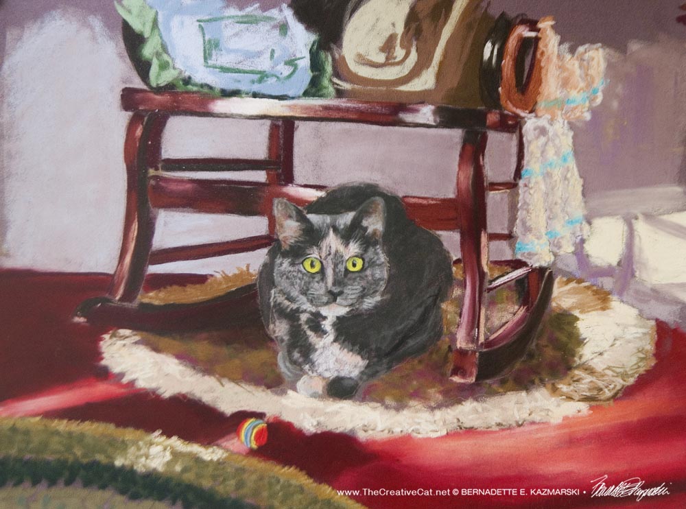
I like the way that crop looks, all the pretty details and all the light. But my first idea was the one below, focusing on just Nikka and her Jupiter ball.
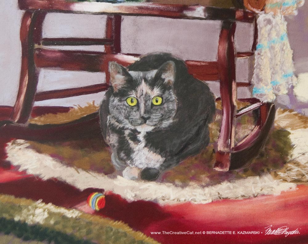
This one gets down to just the essentials—the cat in her domain, and everything in it supports the presence of the cat, which, I realized after a few years of painting my cats, was my goal with my feline artwork. When you look at this you look at Nikka, and her ball stands out even more. The pretty stuff in the background is a nice support for her.
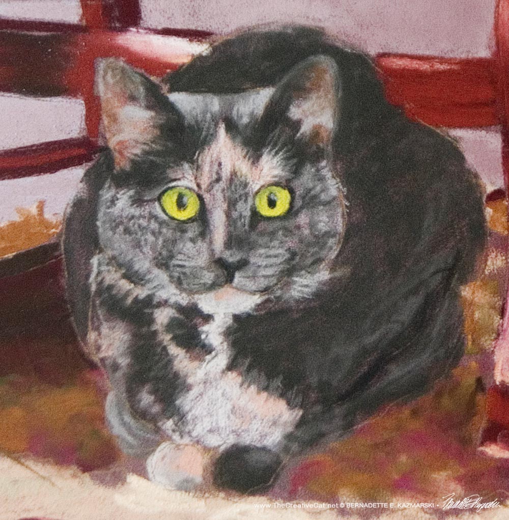
And here is just Nikka. I painted all around her but didn’t change a thing from that first draft.
I’m going to take some time to figure this out, but even though I like the first crop with the pillows on the seat and all the extra space and detail, I think what I really want is the second crop, just the essentials and focusing on Nikka and her ball. And I love it at this stage, a little loose and active, and I’m going to keep that feeling but tighten up a few things on the rocker.
I just have to say that I enjoy watching all the details emerge in this painting, so familiar because they are my bedroom and my things! The mahogany rocker, the round fringed rug underneath and the edge of the braided rug in the lower left, the plywood floor I’d painted tile red, it’s just what I see even today, though things are moved around.
And I love to see this painting that I’ve visualized all these years come to life!
If you have any opinions about which crop version you prefer, please let me know! I do my art as much for you as for me and I’d love to know. I hope to finish it this weekend.
About the materials
I am using Clairfontaine Pastelmat in the color wine, and all those wonderful new Sennelier and Rembrandt pastels. This paper has the sandpaper-like finish that I love to work on, but unlike sandpaper it has layers of grit that are sanded and smoothed so you can add layer after layer of pastel and keep clean, clear edges. The paper grabs the pastel and blending can be a little difficult at first, but layering opens it up. Adding detail is so easy and layering colors gives it such depth.
I almost always start with a mid-range or darker paper because it’s more like what we actually see, a world with highlights and shadows. It’s easier for me to start from a midrange and work a painting of any sort, even abstract, when we portray closer to what we actually perceive so we can block out light and dark areas and work from there. That way your shadows can seem deeper without white behind them, and your highlights immediately look brighter than they would on light paper. Most often I’ll choose a color or tone that is predominant in the final work, but that’s not a logical choice for me, it’s an intuitive feeling. The wine-colored paper was a natural for this painting, but any warm dark tone would have worked. If my paper isn’t the right color or tone I may tint it with a wash of watercolor or ink, or I may give it a layer of pastel, though pastels are expensive enough that using most or all of a pastel to put a background on paper is something I’ll only do with a smaller painting.
Gifts featuring cats you know! Visit Portraits of Animals

Fine Art • Photography • Gifts • Greeting Cards • Books • Commissioned Portraits & Artwork
Visit my gallery of feline artwork on Portraits of Animals.
Copyright
All images and text used on this site are copyrighted to Bernadette E. Kazmarski unless otherwise noted and may not be used without my written permission, although links to your site are more than welcome and are shared. Please ask if you are interested in using and image or story in a print or internet publication. If you are interested in purchasing a print of an image or a product including it, check my animal and nature website Portraits of Animals to see if I have it available already. If you don’t find it there, visit Ordering Custom Artwork for more information on a custom greeting card, print or other item.
Subscribe to my e-newsletter
Subscribe to The Creative Cat Preview E-newsletter.
© 2022 | www.TheCreativeCat.net | Published by Bernadette E. Kazmarski
Weekly schedule of features:
Sunday: Essays, Pet Loss, Poetry, The Artist’s Life
Monday: Adoptable Cats, TNR & Shelters
Tuesday: Rescue Stories
Wednesday: Commissioned Portrait or Featured Artwork
Thursday: New Merchandise
Friday: Book Review, Health and Welfare, Advocacy
Saturday: Your Backyard Wildlife Habitat, Living Green With Pets, Creating With Cats
And sometimes, I just throw my hands in the air and have fun!
PORTRAITS OF ANIMALS WEBSITE
FACEBOOK | TWITTER | LINKEDIN | PINTEREST | TUMBLR | INSTAGRAM | YOUTUBE| EMAIL | PATREON

Pingback: Featured Artwork and March Desktop Calendar: Nikka's Jupiter Ball - The Creative Cat
I love everything about this post, from the beginning of how you started the artwork and to explaining about the pastels. It’s such a beautiful painting and love how it all came together. Nikka looks so purrfect there! And we have one of those balls too! All so beautiful! XO
I’m so glad you enjoyed it! I love writing about my art and especially telling the story of the subject as well as how I create the work. That usually shows up in “Featured Artwork” and sometimes “Marketplace,” and I especially enjoyed describing it when I did my “Daily Sketches.” It keeps me on my toes!